
The Digital Marketing Pro Blog
Sign up to the Digital Marketing Pro Newsletter and get these articles delivered every week!
PLUS Subscribers get 50% OFF on-demand courses!
Get creative with colour, and play with colour in your creatives 🎨
Whether you have a nailed-down brand identity guide or not, you'll likely have a colour pallete that you use in your designs to represent your brand.
As you can see, Playfair are rocking the pink and black (the designer in me screams out "it's actually coral and very dark grey!!")
But don’t worry about using additional colours in your designs even if they sometimes don’t compliment your brand!
It’s all about initial striking creative.
🧦 Bombas have done an excellent job here, minimising their usual navy blue for a wash of warm grey and striking colours to promote their new Pride collection:
 But don’t worry about using additional colours in your designs even if they sometimes don’t compliment your brand! It’s all about initial striking creative. 🧦 Bombas have done an excellent job here, minimising their usual navy blue for a wash of warm grey and striking colours to promote their new Pride collection:")
 But don’t worry about using additional colours in your designs even if they sometimes don’t compliment your brand! It’s all about initial striking creative. 🧦 Bombas have done an excellent job here, minimising their usual navy blue for a wash of warm grey and striking colours to promote their new Pride collection:")
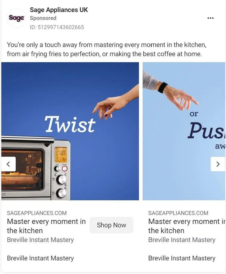
☕ The dark purple of Sage Appliances is almost non-existant in this beautiful carousel ad!
Attractive colours that stand out, paired with an excellent layout of text and photography really negate the need to plaster the ad in the usual purple.
Great work Sage!


✏️ Choose colours that reflect the message you're conveying: an ad for a thick, cosy jacket might be paired well with a cold blue to symbolise it's use and need
✏️ Combine complimentary colours: similar tones work well, or pairing the right contrasting tone can make for a striking ad
✏️ Work your brand colour in, if possible: your colour helps to establish your brand, but you don't have to rely on it in social ads. Spark that interest, get the initial click, then the rest of your customer journey can be branded up to the eyeballs!

Digital Marketing Pro is brought to you by Playfair Marketing Ltd.
© 2024 Playfair Marketing Ltd. | Terms & Conditions | Privacy Policy | Cookie Policy