
The Digital Marketing Pro Blog
Sign up to the Digital Marketing Pro Newsletter and get these articles delivered every week!
PLUS Subscribers get 50% OFF on-demand courses!
'Tis the season(s) 🌻☀️🍂❄️: Colour design tips
Use colours that reflect the time of year in your ad creatives and more
An excellent way to stay on-trend is to reflect the seasons but using relevant colours in your ads!
But they’re often attractive colours that make for strong creatives, and they meet your audience where they're currently at:
")
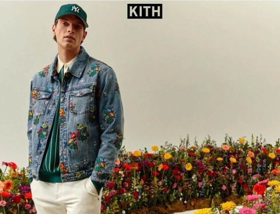
KITH's use of the flowers in the creative is such an obvious link to spring that there's no doubt this is a new spring collection (plus the flowers on the actual jacket!)
 Sometimes its OK to break-brand (we'll talk more about this next week!) to mix up your creative. Consider these colour combinations: 🌻Spring: Shades of pink, blue and green ☀️Summer: Yellow, aqua, deep or muted blues 🍂 Autumn: Oranges and burgundy, mixed with peach/skin tones ❄️Winter: Navy blue and pale blue, as well as silver/grey 🎅🏻 Bonus! Christmas: Deep and bright reds, forest green and gold! Schemes to inspire in Canva's Colour Palettes ↗️")
Moving away from their usual peach-like brand colour, Exchange Flags throw in a couple of different colours to promote the Summer in the Square (no CTA means this is a post-boost though 😢)
Sometimes its OK to break-brand (we'll talk more about this next week!) to mix up your creative. Consider these colour combinations:
🌻Spring: Shades of pink, blue and green
☀️Summer: Yellow, aqua, deep or muted blues
🍂 Autumn: Oranges and burgundy, mixed with peach/skin tones
❄️Winter: Navy blue and pale blue, as well as silver/grey
🎅🏻 Bonus! Christmas: Deep and bright reds, forest green and gold!

Digital Marketing Pro is brought to you by Playfair Marketing Ltd.
© 2024 Playfair Marketing Ltd. | Terms & Conditions | Privacy Policy | Cookie Policy